CME Tracker help
1What this is
CME Tracker is a live, interactive view of space weather between the Sun and Earth — it shows where coronal mass ejections are, where they're headed, and when (and whether) they'll hit us.
A coronal mass ejection (CME) is a billion-ton cloud of magnetized plasma blasted off the Sun. When an Earth-directed one arrives — typically 1 to 3 days later — it can compress Earth's magnetic field, light up auroras, and disrupt satellites, radio, and power grids. This tool catalogs every CME NASA has recorded over the last 90 days, draws each as an expanding cone on a top-down map of the inner solar system, and propagates it outward to estimate its arrival. (For the full plain-English story of what a CME is, see the explainer — this page covers the tracker itself.)
2Quick start
Your first visit shows three short pointers on the map, the timeline and the Layers menu, then gets out of the way. Want the guided version? The six-module course puts the live map on the page with one thing to do per module, about 40 minutes end to end. Teachers: three ready lesson plans.
- Look at the center map. The Sun is in the middle, Earth is the blue dot on its orbit, and each colored wedge is a CME fanning outward. Color = speed.
- Pick a CME. Click a wedge, or a row in the CME Catalog on the left. The app jumps the clock to that storm and animates it toward Earth.
- Watch the dashboards on the right update — the Earth globe shows which face the storm would strike and how the magnetosphere reacts; the charts show the solar wind and geomagnetic activity.
- Press space to play time forward, or drag the timeline at the bottom. Press N (or LIVE) to snap back to real time.
3The heliocentric map & its layers
The central canvas is a top-down view of the inner solar system, looking down on Earth's orbital plane. The same scene can also be flown as a real three-dimensional one — see §13.
- The Sun sits at the center. Earth is the blue dot, moving along its orbit (the ring). Earth's position is computed for whatever moment the clock shows.
- CME cones expand outward from the Sun. Each cone's direction is the CME's measured launch direction, and it spans ± the measured half-angle on either side of that axis (so its full width is twice the half-angle). A cone aimed at Earth's dot will reach it; one pointing elsewhere sails past.
- Color encodes speed — cool (slow) to hot (fast):
- A CME whose direction NASA hasn't triangulated yet is drawn as a faint directionless shell (a full ring rather than a cone) — we don't pretend to know where it's going.
- When an Earth-directed CME reaches Earth's distance, the dot flashes to mark the impact.
Navigating
- Scroll / pinch to zoom, drag to pan. The
⤾ viewbutton resets the framing. - Hover a cone for a quick tooltip (speed, direction, geometry, ETA). Click it to select.
- The
▦ Layersmenu (top-right of the map) opens with three one-tap presets — Monitoring (the daily-check view: slow CMEs hidden, spacecraft on, pinned to LIVE; key1), Clean (just the map, both panels collapsed; key2), and Sensory overload (everything on at once; key3). A preset is a starting point, not a lock — every switch stays individually tweakable after you apply one, and?mode=monitoringin the URL applies one on load. Below the presets sit the ten overlays described in Layers, just below.
Layers
Each overlay is one switch in the ▦ Layers menu. Regions facing Earth, Radiation belts, Solar flares, Radio bursts, Labels and Cinematic view are on by default; the rest are off until you switch them on, and your choices are remembered. The screenshots below are from the May 2024 Gannon replay unless noted.
- ▤ Regions facing Earth — a lane on the timeline's future side, on by default. Each numbered sunspot region gets a bar from now until it rotates out of the strike zone (within 45° of the Sun–Earth line), and the bar's brightness is that region's chance of producing an Earth-directed CME in the next three days, computed here from where it sits, its magnetic class and area, and what it did in the last week. Hover or tap a bar for the numbers, and the region lights up on the Sun panel. Quiet regions share one faint row. Two honesty rules are built in. The odds are capped at 30%, because above that the model over-forecast in testing. And about half of all Earth-directed CMEs come from no numbered region (filament eruptions, stealth CMEs, sources NASA never pinned down), so an empty lane never means nothing is coming; the lane can only see the regions it can name. The model is a nine-term logistic fit on 14,175 region-days from 2014 to 2024 (scripts in the repo): a region inside the zone that fired in the last week reaches an Earth-directed CME within three days about 19% of the time, a beta-gamma-delta region that fired about 38%, against 3% for a region outside the zone. Cross-validated discrimination is solid (AUC 0.73 to 0.76) and the reliability curve is straight below 30%. Because NASA attributes far more CMEs to regions now than in 2016, the model's baseline is re-solved monthly on the trailing year of outcomes rather than trusted from the original fit. No return bars: a productive region comes back numbered only 44% of the time and fires promptly one time in five, so that is a sentence on the card, not a shape on the timeline.
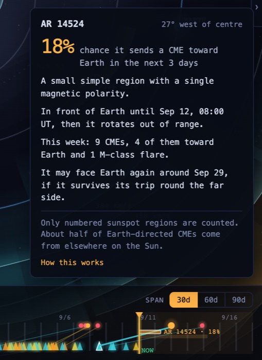
Regions facing Earth. The bar runs from now until the region rotates out of range; hover it for the card. Live view, Sept 2026.
- ≋ Fluid model — the solar wind as the moving fluid it is, painted across the whole plane under everything else: speed (blue slow, green and yellow faster, red 1,000+ km/s) or density (blue thin, red dense), switchable in the legend, on the same colour scales NOAA's Enlil pictures use. It's computed in your browser, in a couple of seconds, from two things this site already has: the wind we measured at L1 over the last solar rotation, mapped back to the Sun so the fast streams and slow sectors sit where they really were, and every CME on the map, launched as a dense fast pulse that plows through that wind. Fast wind catching slow wind piles up into the bright spiral bands; a CME's compressed sheath and the rarefied wake behind it form by themselves, because mass and momentum are conserved along each ray. The layer follows the playhead, Isolate and Solo like any other, so you can watch one CME's wake alone, or a whole week of eruptions interacting. Honesty notes, also in the legend: it's the ecliptic plane only, so a CME whose cone never crosses the plane is skipped and the legend says so; there is no magnetic field in it, so it says nothing about Bz or how strong a storm gets; densities are right in pattern, not calibrated in number; and the background wind is measured only where L1 had data, otherwise assumed. Tested the same way as the drag model, on 171 NASA-catalogued shocks from 2014 to 2024 where the CME's cone crosses Earth in the plane, its arrival-time error is 11.8 hours on average (median 9.2) against the drag model's 13.6 on the same events and NOAA Enlil's 11.2, using only wind measured before each CME launched; details in How accurate?. It is our own reduced-physics model after HUXt (University of Reading, MIT licence), not a NOAA product; NOAA's Enlil is a full 3D magnetohydrodynamic run on a supercomputer, and its images are the reference if you want the real thing.
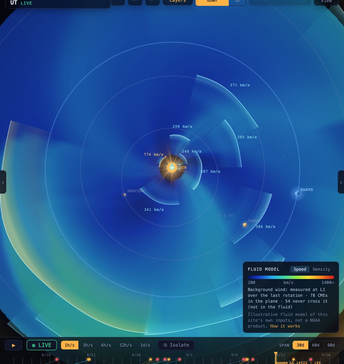
Fluid model, speed. Fast CME material in green and yellow against the slow blue background wind measured at L1 over the last rotation.
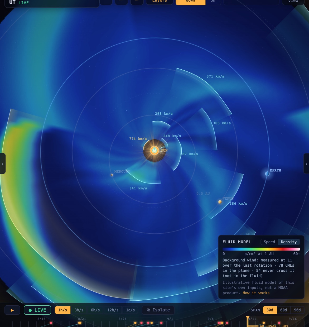
Fluid model, density. The bright arcs are compressed sheaths the CMEs pile up ahead of themselves; the darker wake behind each is rarefied.
- ⤳ Streams — high-speed streams: fast solar wind (600–800 km/s) pouring out of coronal holes, drawn as the corotating spiral bands they really are, in teal, each labelled with its measured speed. They come from our own wind archive, not a model — a stream is drawn once the L1 wind has actually risen — and because coronal holes outlive a solar rotation, a dashed band marks where the same stream is predicted to return 27 days later. Live only: the layer clears during replays, where detection doesn't apply.
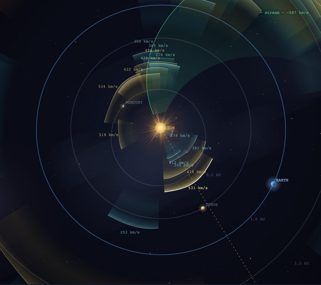
Streams, live view. Fast wind from a coronal hole is a spiral, not a straight jet, because the Sun rotates while the wind flows outward.
- ⌀ Parker spiral — the shape the Sun's magnetic field is dragged into by the solar wind: a garden-sprinkler spiral of faint field lines, wound tighter in slow wind and looser in fast. It's the reference grid for everything magnetic on this map — streams follow it, energetic particles ride it, and the Connectivity line is one strand of it.
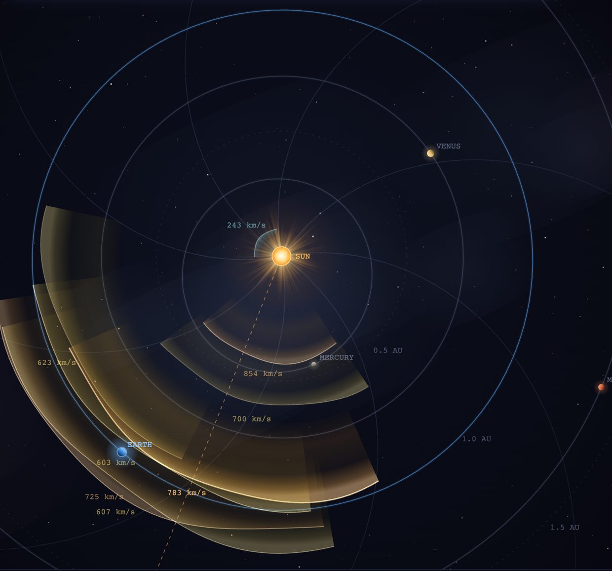
Parker spiral. Subtle on purpose; it's a backdrop for the other layers.
- ⌁ Connectivity — shows the single Parker-spiral field line that links the Sun to Earth, marked at its solar footpoint (~W55 in typical wind). The footpoint is computed from the wind speed measured at the displayed moment, so it moves as you scrub or replay: slow wind winds the spiral tighter (footpoint near W65), a fast stream relaxes it (near W35) — and when no measurement covers the displayed moment, the label says
est. windinstead of pretending. A shaded green fan marks the well-connected zone — footpoint ±45° — because energetic particles travel along field lines: an eruption inside that fan reaches Earth in minutes, even when it's far off the Sun–Earth line. The second, brighter spiral that appears with a selection is the selected CME's own field line; it belongs to the selection, so it goes when you deselect (Esc, or ✕ on the card) and returns when you select again. Select a CME and its source is flagged connected (amber, particles stream to Earth) or not connected (dashed), with the angle from the footpoint. And when the eruption demonstrably dosed Earth, measurement outranks geometry: the line turns hot (☢ SEP observed) and shows how long the protons actually took to arrive. This is why a west-limb flare that misses Earth can still dose it (see the radiation card).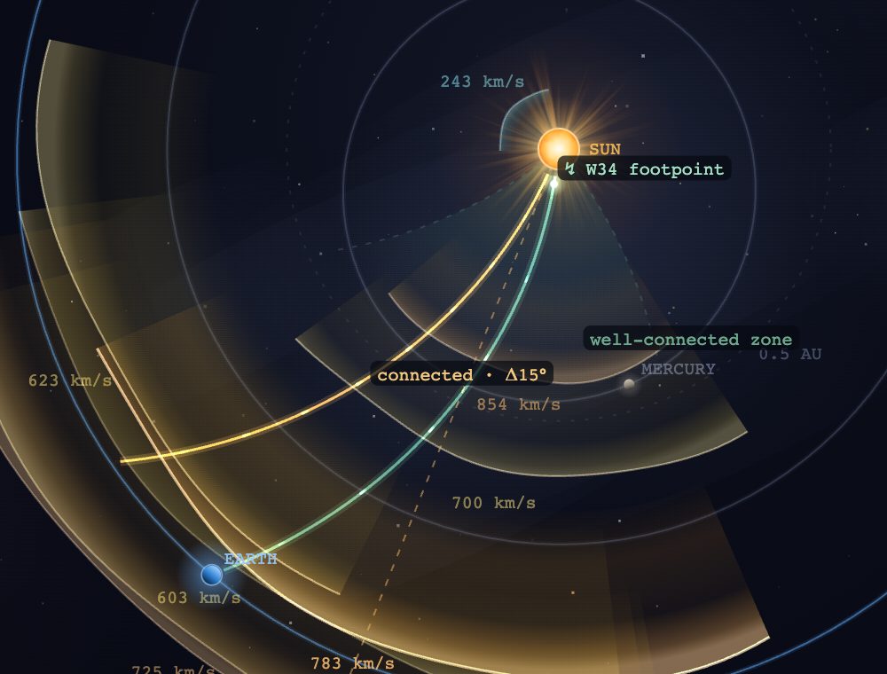
Connectivity with a CME selected: the footpoint label, the well-connected fan, and the source flagged as connected.
- ⬡ Spacecraft — marks where the observatories this site pulls data from actually sit. Three of them cluster at Earth: the L1 fleet (SOHO, ACE, SOLAR-1, IMAP, and DSCOVR, retired from real-time duty in 2026) sits ~1.5 million km sunward of Earth — only about 1% of the way to the Sun, so it hugs Earth until you zoom in — while GOES and SDO orbit so close to Earth they're labelled on it rather than drawn separately. The interesting ones orbit the Sun independently: STEREO-A, well off the Sun–Earth line (a faint sightline shows its view toward the Sun) — the second viewing angle that lets NASA triangulate each CME's true direction and width; Parker Solar Probe, diving through the corona itself; and Solar Orbiter, whose Venus-resonant orbit tilts higher with every flyby to climb toward the Sun's poles — its label reads out its live latitude, the dimension the top-down map can't draw. Hover or tap any marker for a popup describing what that craft does — Solar Orbiter's popup also draws its orbit edge-on: the tilted ellipse against the flat ecliptic (Earth on the plane for contrast), its current height above or below it, and dashed guides at the planned 24° and 33° tilts of the coming Venus flybys. The layer is time-aware — a spacecraft only appears once the displayed time is past its launch, so a 2003 or 2012 replay shows only the craft flying then (no DSCOVR before 2015), and the 1859 Carrington replay shows an empty sky. Positions are approximate, plotted in the orbital plane.
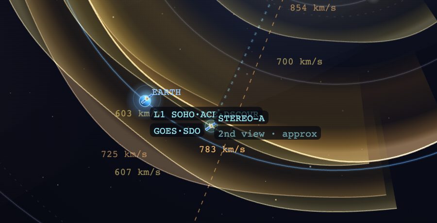
Spacecraft around Earth. Zoom in and the L1 cluster separates from Earth; STEREO-A's dotted sightline is its view of the Sun.
- ✦ Solar flares — draws each flare erupting at the Sun, timed to the playhead: a flare flashes when the timeline reaches its peak, then fades over about three days. It's drawn at the Sun's edge pointing in the flare's source direction — the same way the CME it launched points — and colored by GOES class (X red, M orange, C blue), with the strongest getting spikes. A dashed ring means that flare launched a CME; select that CME and its flare is highlighted. Play or scrub the timeline to watch flares fire in sequence.
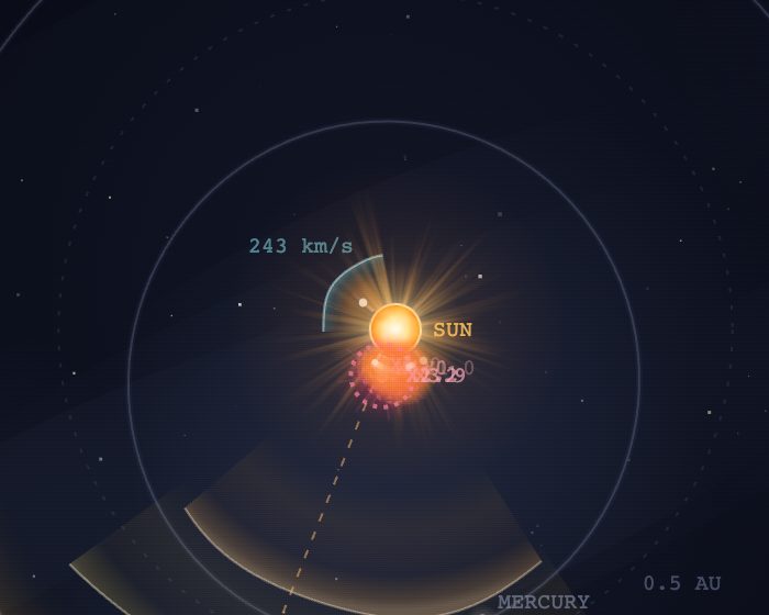
An X-class flare at its peak, with the dashed ring that means it launched a CME.
- ⌁ Radio bursts — solar radio sweeps logged by NOAA's ground observatories, drawn at the Sun and timed to the playhead in teal so they read apart from flares: a Type II (a shock leaving the Sun) as a double arc, a Type III (electron beams) as spikes, others as a ringed dot. A Type II is the earliest sign a CME has launched: across 421 of them since 2015, 87% were followed by a catalogued CME, and the burst led NASA's first coronagraph sighting by a median 27 minutes (the analysis itself follows hours later). When we can pin the source to a flare, we draw a dashed provisional cone through the same physics as every other CME at the typical speed and width of Type II CMEs (670 km/s, 36°; half of them run 470 to 930 km/s). We tested deriving the speed from the burst's frequency drift on 391 events and it had no skill, so we don't. The cone is labelled "provisional" on the map, in the catalog and on its card, and dropped the moment DONKI posts the measured one. When the playhead crosses a burst, a faint ripple races to Earth's orbit: radio takes eight minutes to get here, which no playback speed can show, so it's a cue, not a scale. On by default.
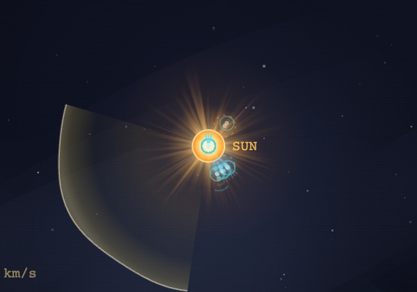
Radio bursts, zoomed in on the Sun at 08:11 UT on Sept 7 2026: the teal glyphs are Type III bursts firing with an M-class flare, next to the CME that erupted with it.
- ⦵ Side view — an edge-on inset (bottom-left of the map; the × in its corner turns the layer off) showing each cone's solar latitude: the dimension a top-down map can't show. A CME can look Earth-aimed in longitude yet fire well above or below the ecliptic — the side view is where you catch it. The Sun sits at the left, Earth at the right on the dashed ecliptic, and each CME is a slice tilted to its true latitude.
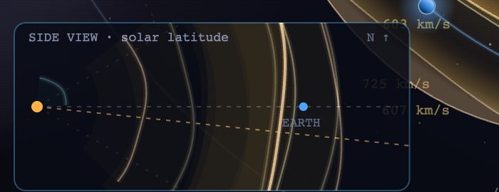
Side view. These Gannon CMEs straddle the ecliptic, which is why they hit.
- ⊙ Top view — a plan-view inset of the whole inner system (the × in its corner turns the layer off). Most useful in the 3D view, where it keeps true heliocentric longitudes on screen while you fly the camera, but on the flat map it earns its place too: it stays zoomed out while you zoom in, so you never lose track of where Earth is.
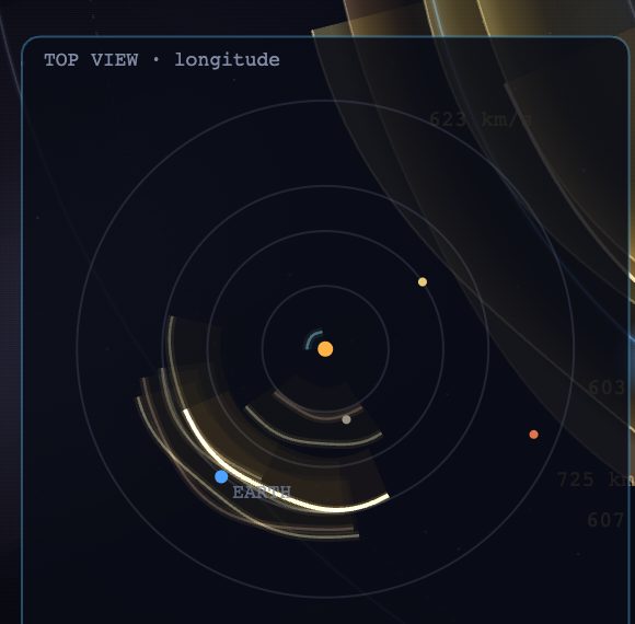
Top view. The whole inner system at a glance, whatever the main map is doing.
- ✨ Sparkles — a drifting particle haze inside each CME wedge. Pure atmosphere: it costs some frame rate on older machines and tells you nothing the wedge doesn't.
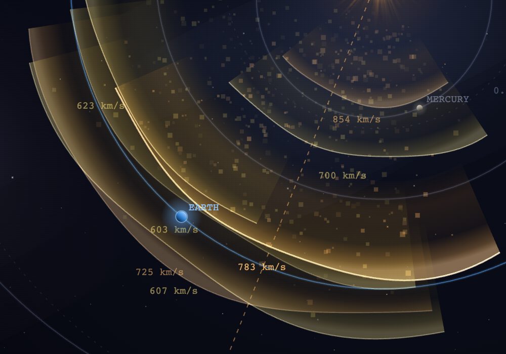
Sparkles on. Eye candy, honestly labelled.
- a Labels — toggles all on-map text: planet names, CME speeds, distance rings, and the layer labels above. Turn it off for a clean picture or a screenshot.
- 🎬 Cinematic view — the app's default look: textured, slowly churning Sun, deep-space backdrop, glowing turbulent CME fronts, lit planets. Same physics, same data, same interactions — only the rendering changes. Prefer the original flat rendering? Untick it; your choice is remembered, and
?viz=classicapplies it via URL.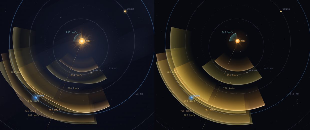
Cinematic (left) and classic (right). Same moment, same CMEs.
4The header readouts
The header strip mirrors the latest live values — daily sunspot number and F10.7 solar radio flux (the two classic whole-Sun activity gauges, updated daily from NOAA), then wind speed, proton density, Bz, Kp and Dst — plus a Data indicator showing whether the feed is live/cached and how fresh it is. The five geomagnetic readouts are buttons: click one (or focus it and press Enter) and it opens a visual popup that makes the number mean something. Each is described below; popups close on Esc or a click anywhere else, and only one opens at a time. (Sunspots and F10.7 also drive the band-by-band HF radio conditions page.)
The Solar wind popup — the freight already in flight
Solar-wind speed matters for one reason: it sets the warning time. So the popup draws the Sun→Earth corridor with the wind currently en route, as a clearly-labeled time-lapse (at true speed the crossing takes days): a bright parcel departs the Sun and crosses to Earth, its label counting the trip as it goes ("in flight 1.0 d · Earth in 2.2 d") — a 3–4 day journey at typical speeds, which is exactly the lead time this site's forecasts live on. Calendar ticks under the corridor turn it into a forecast timeline: each tick marks where the wind arriving on that day is right now — Monday's weather is already two-thirds of the way here, Wednesday's is just leaving the Sun.
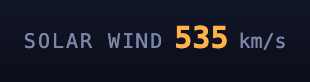
The header readout during a moderate 535 km/s stream — click it to see what's in flight.
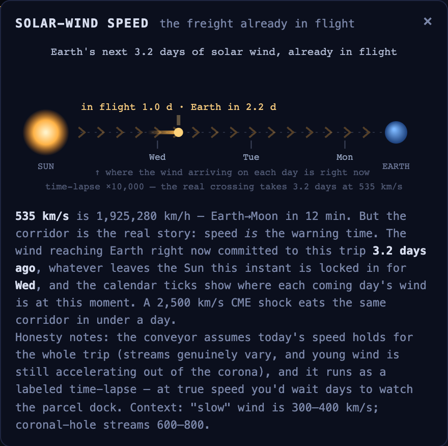
The corridor as a calendar: the parcel is a day into its 3.2-day trip, and the ticks show Monday's wind nearing Earth while Wednesday's is still leaving the Sun.
The lapse factor is stated on-canvas where it applies, and the note flags the working assumption honestly: the conveyor holds today's speed for the whole trip, and real streams genuinely vary — which is exactly why the arrival days shift when the wind speeds up or slows down.
The Density popup — the measurement, drawn to count
Density is defined as protons per cubic centimeter, so this popup isn't a metaphor: it draws a 1 cm cube of space holding exactly the current reading's worth of protons, drifting through with the wind. The count follows the live number — when a CME's compressed sheath arrives and density jams from ~5 to 20–50+, you watch the cube crowd up, one of the first visible signs of impact.
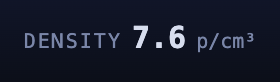
7.6 protons per cubic centimeter — click to see all eight of them.
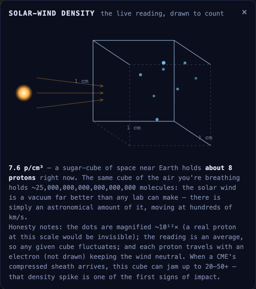
7.6 p/cm³ — eight protons in a sugar-cube of space. The same cube of the air you're breathing holds ~25 quintillion molecules.
The fine print keeps it honest: the dots are magnified ~10¹²× (a real proton at this scale would be invisible), the reading is an average so any actual cube fluctuates moment to moment, and every proton travels with an undrawn electron that keeps the wind electrically neutral.
The Bz popup — the magnetic gate
Bz gets the most consequential visualization because it is the most consequential number: it decides whether the wind's energy gets in at all. The popup animates dayside magnetic reconnection from the live field. Earth's dayside field lines always point north — the fixed door frame. The incoming field dashes are tilted to the measured Bz/|B|: pointing north, they can't reconnect, and you watch them slide around the magnetopause and past Earth — gate closed, same wind, no storm. Pointing south, they splice with Earth's field at the nose (the flashes), and the opened lines peel poleward, funneling energy into the polar cusps and brightening the aurora caps.
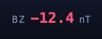
The readout turns red when Bz swings south enough to drive storming — click for the gate.
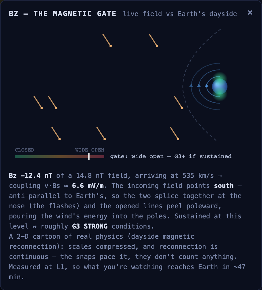
A strongly southward spell (Bz −12.4 nT): the gate meter pegged at "wide open — G3+ if sustained," aurora caps glowing.
The CLOSED→WIDE-OPEN meter is driven by the physical coupling term v·Bs — the same quantity the tracker's alert system watches at L1 — mapped to the calibrated storm tiers. Its honesty notes ride along in the popup itself: a 2-D cartoon of real physics with compressed scales, reconnection is continuous (the snaps pace it, they don't count anything), and the reading is measured at L1, so the scene you're watching reaches Earth ~30–60 minutes later.
The Kp meter & forecast popup
The header's Kp readout includes a mini-meter: nine segments spanning the full 0–9 scale, lit to the current value and colored along the quiet-green → storm-red ramp — so you can see at a glance where the current number sits in the range (storms begin at segment 5, where the ambers start).

The meter during a G3 storm — seven segments lit, deep into the amber zone.
Click the meter (or press Enter on it) and a panel opens charting the past week of measured 3-hour Kp alongside NOAA's official 3-day forecast. Solid bars are measurements, dimmed bars are NOAA's preliminary estimates, and hollow outlined bars are the forecast — model output never masquerades as measurement. Amber bars show where this site's drag model expects inbound CMEs to arrive: the solid part is the estimated Kp and the faint dashed extension above it is the plausible upper bound, the same range the impact card shows, so you can see whether NOAA's forecast bump lines up with a CME we're tracking. Arrivals within eight hours of each other merge into one bar labelled with the count, because at the model's ±12 h they are one event, and a pile-up is what makes storms big.
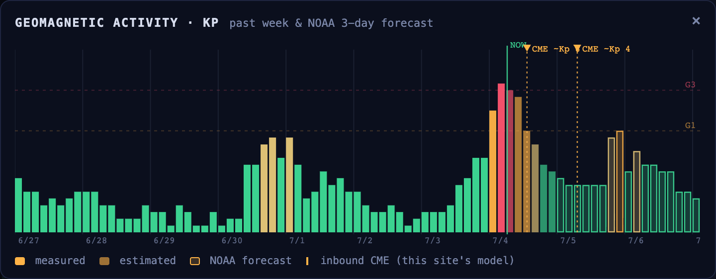
A real storm in progress: the week's history peaking past G3 at "now", NOAA's forecast settling, and two inbound-CME arrival markers from the tracker's model.
The Dst popup — the ring current
Dst is the storm's depth rather than its activity: how much the ring current, the belt of charged particles circling Earth, has weakened the field at the equator. The popup draws that torus at its live strength and plots the past week of hourly Dst against the storm thresholds (−50 moderate, −100 intense, −250 super), with the phases labelled: the sudden commencement, the main-phase plunge, the slow recovery. A ladder alongside places today's value against the Gannon storm (−412 nT), Québec 1989 (−589), Carrington (estimated near −900) and the deepest hour of this year, so a number that means little on its own reads as a distance from history.
5CME Catalog (left panel)
Every CME from NASA DONKI over the last 90 days. The count next to the title shows how many are visible vs. total.
Speed-class filter
The chips at the top filter both the list and the map by speed class. All five classes show by default; click a chip to hide or show that class, and the choice is remembered. Hiding the slow S ones (they rarely cause storms) is the usual first move, and the embed widget does it for you.
Target planet — Earth, Mercury, Venus or Mars
The ◎ Directed at dropdown re-aims the whole app at another target. Pick Mercury, Venus, Mars — or the Solar Orbiter spacecraft — and the catalog verdicts, the directed-only filter, the arrival times, and the timeline all switch to it, and it gets ringed on the map. Because the inner planets move quickly, plenty of CMEs that miss Earth are aimed straight at one of them; Solar Orbiter's hit-test additionally accounts for its tilted orbit (it rides up to ±13° out of the ecliptic). Relatedly, selecting any CME shows a SolO view line in its impact card: the angle between the CME's axis and Solar Orbiter's vantage — ~90° means the spacecraft sees a clean side-on "limb" eruption (the geometry its imagers measure best), while head-on means it sees a hard-to-measure halo. (Arrival times off Earth are model estimates — our accuracy is validated at Earth only — and the storm, aurora & Kp readouts always describe Earth.)
Directed-only filter
The ▲ <planet>-directed only toggle restricts the catalog — and the map & timeline — to CMEs headed at the selected planet (direct and glancing), hiding misses and undetermined ones. It combines with the speed filter, so you can zero in on, say, fast Earth-bound storms in one view.
Hide undetermined direction
The ⊘ Hide undetermined direction toggle removes CMEs whose direction NASA hasn't measured yet — the AWAITING TELEMETRY and DIRECTION UNDETERMINED rows — so the catalog and map show only events with a known geometry.
Reading a row
Each row shows the launch time (with the year for historical events), a speed-class badge, the speed in km/s, the source direction (e.g. N12W34 in solar coordinates), and the cone half-angle. The colored badge underneath is the geometry verdict:
| EARTH-DIRECTED | The cone covers Earth — expect an arrival. An ● IN FLIGHT tag means it has launched and is en route right now. |
| GLANCING | Earth sits near the cone's edge — a flank hit is possible but weaker. |
| MISSES EARTH | Aimed away from Earth; no impact expected. |
| AWAITING TELEMETRY | Direction not triangulated yet — too soon to call. (Becomes DIRECTION UNDETERMINED after ~4 days, when it's clear no analysis is coming.) These never affect the Earth globe. |
Click a row to select it (the map jumps to it and animates). Use ↑/↓ to move through the list.
6Recent Flares (left panel)
Solar flares from GOES X-ray sensors over the last 7 days, newest first. Class letters run A · B · C · M · X, each ~10× brighter than the last (X is the most intense).
- A flare tagged → CME launched a coronal mass ejection. Click it to jump to and select that CME — and the matching burst pulses on the Sun image.
- Flares without the tag produced radiation but no catalogued ejection. Every row is still clickable: it jumps the playhead to the flare so you can watch it fire on the map and the Sun panel.
- Small
⌁II/⌁III/⌁IVchips on a row are the radio bursts logged with that flare (see Radio bursts in §3). A Type II chip means a shock left the Sun, the earliest sign a CME launched; click the chip to scrub to the burst. - By default the list shows all flares. The toggle under the header flips to → launched a CME to show only the ones that produced a coronal mass ejection (the events relevant to tracking).
7Selected CME card (right panel)
When you select a CME, this card breaks it down:
- Speed & direction — the measured launch velocity and heading.
- Geometry — Earth-directed, glancing, miss, or awaiting telemetry, with the angular offset from the Sun–Earth line.
- Estimated arrival ± uncertainty — when the leading edge reaches Earth, with the model's error band (~±12 h).
- Transit time — how long the Sun-to-Earth journey takes.
- Source flare — the flare that launched it, if known (click-through).
- Storm potential — the predicted geomagnetic response as a range: the most-likely level and a plausible upside (e.g. "Kp ~4.8, up to 6.8"). The estimate is calibrated against a decade of observed storms, and the range isn't hedging — storm size mostly depends on the CME's magnetic-field orientation (Bz), which physically cannot be known until the cloud reaches the L1 monitor ~30–60 minutes before Earth.
- Headline — the card leads with the state: Arrives in … with the estimated moment and its ± band, or Arrived … ago once the front has passed Earth.
- SolO view — the angle between the CME's axis and Solar Orbiter's vantage: near 90° means the spacecraft sees a clean side-on eruption, head-on means a hard-to-measure halo.
- Radio — the HF outlook for that CME (degraded for 24–48 h after arrival, polar paths worst; possible auroral scatter on 6 m and 2 m), and any Type II or IV burst logged with its launch.
- NASA's note — the analyst's free-text comment from DONKI, followed by a link to the DONKI event itself.
- ◎ Solo — hides every other CME on the map so you can watch this one alone, and it keeps working while pinned LIVE. 🔗 Copy link copies a web address that opens the tracker on this CME (see §16).
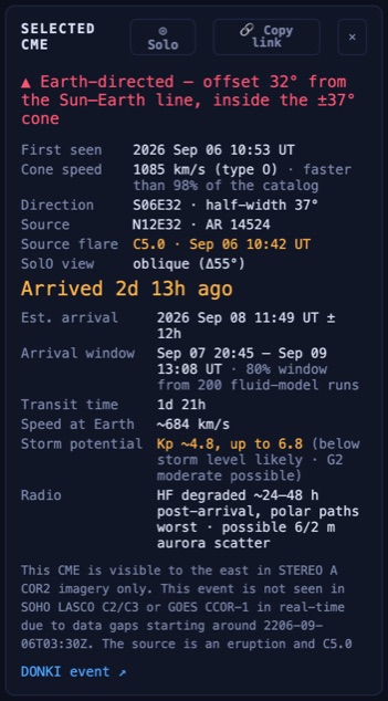
The card for the Sept 6 2026 CME: the geometry verdict at the top, then the estimate, the 80% arrival window from the ensemble, and the storm potential.
9Magnetosphere, radiation belts and satellite drag
The Magnetosphere card in the right panel draws Earth's magnetic shield as the solar wind is shaping it at the displayed moment: the magnetopause in amber, where the wind's pressure balances Earth's field, and the bow shock in cyan standing off ahead of it. The Sun is to the left and north is up. The headline number is the distance from Earth to the nose of the magnetopause in Earth radii; about 10 in quiet wind, and pushed inward by dense, fast wind and by southward Bz. The dashed line through Earth is geosynchronous orbit seen edge-on, at 6.6 Earth radii: when the nose comes inside it the card turns red, because the satellites on the day side are then sitting out in the solar wind. That happened during the Gannon storm; scrub the replay to May 10 2024 and watch it. Click the card, or pick Magnetosphere in the view control, for the full rotatable view on the map stage, driven by the timeline like everything else. The shapes are the Shue et al. (1998) magnetopause and the Farris & Russell (1994) bow-shock stand-off, empirical average surfaces fit to decades of spacecraft crossings. They are axisymmetric, have no cusps or dawn–dusk asymmetry, and the real boundary wobbles around them by an Earth radius or so; treat the number as a good estimate, not a measurement. The L1 confirmation email quotes the same figure. Drag to rotate and scroll to zoom, or pick From above or From the side from the camera select beside the view control; the readings stay on the card. Earth-directed CMEs appear on the stage as a sheet in their speed-class colour that closes in from the Sun side over the 12 hours before their forecast arrival, then sweeps through and fades. At this scale a CME front really is a flat wall, but its approach is drawn as a countdown rather than to scale: at 600 km/s it would cross the whole view in seven minutes. With the Spacecraft layer on, GOES-East, GOES-West and SDO sit on the GEO ring at their real local hour angle and turn red when the boundary has left them out in the solar wind, and a marker shows where the L1 fleet is, 235 Earth radii up the Sun line. The Side view and Top view insets draw here as well.
Radiation belts
The Radiation belts layer (on by default) fills in the Van Allen belts as the space between the field lines: the inner proton belt, steady, and the outer electron belt, whose brightness follows the GOES ≥2 MeV electron flux at geosynchronous orbit that NOAA publishes every five minutes. When a storm pushes the magnetopause in, the outer shells that reach the boundary drain, and in the days after, the belt refills hotter with its peak moved inward; the card says when the flux at GEO is above NOAA's 1,000 alert level, the regime where satellites charge internally. The belt shape is an illustrative profile pinned to the GOES value, not a radiation model, and our electron archive starts in September 2026, so earlier replays draw no belts.
Satellite drag and the Atmosphere view
The Satellite drag card and the Atmosphere view take the storm one step further down: into the upper atmosphere. Geomagnetic storms heat the thermosphere, it swells outward, and everything in low orbit meets denser air and sinks faster. The view draws the atmosphere as altitude shells coloured by air density, brighter and warmer as it inflates, with the ISS, Tiangong, Hubble and the Starlink shell at their real altitudes from the day's orbital elements and the decay each one implies. The headline is air density at 400 km as a multiple of a quiet day: about 1 in calm conditions, 2 to 3 in a severe storm, and it stays high for a day or two after the storm ends because the atmosphere cools slowly. A second line says how long a batch launched to 210 km would last, which is the February 2022 Starlink loss in one number. The model is a simple scale-height atmosphere driven by F10.7 and the previous three days of geomagnetic activity, not NRLMSIS. Its constants were fitted against eleven years of measured decay for the ISS, Tiangong and Hubble from their published orbital elements, so its storm response matches the record, and where we have a day of measured decay for an object it sits next to the model's figure as the ongoing check. The scoreboard in section 18 keeps the running tally: over the last 90 days, how far the model's decay sits from the measured decay for the ISS, Tiangong and Hubble, and what the ISS actually did on storm days against what the model said.
10Earth — sun-facing side (right panel)
A globe rendered from the Sun's point of view, so you see which face a storm would strike on arrival. It updates to whatever moment the clock shows. In cinematic view it renders real NASA Blue Marble imagery (re-projected to the sub-solar hemisphere) with aurora curtain rays; classic view keeps the original drawn globe.
- Day/night terminator & sub-solar point — the lit hemisphere and the spot where the Sun is directly overhead. This is how the tool knows which side of Earth is sun-facing when a CME arrives.
- The magnetosphere — the blue field bubble. It compresses when solar-wind dynamic pressure rises, and energy couples in when the field turns southward (negative Bz).
- Aurora ovals — drawn around both poles and sized by the Kp index; high Kp pushes them toward the equator.
The small tag by the title states what you're seeing: live now, at map time, ⚡ CME impact, ✓ Earth clear (a near-miss), replay, or at CME arrival. The caption beneath spells out the sub-solar point, the aurora Kp, and the wind/Bz coupling.
Who drives the globe: selecting a CME with an Earth arrival pins the globe to that arrival moment while playback is paused (the at CME arrival preview — which face gets hit). The moment you move the timeline yourself — drag or arrow keys — the globe follows your playhead instead, and stays with you until you select a CME again, which re-arms the preview.
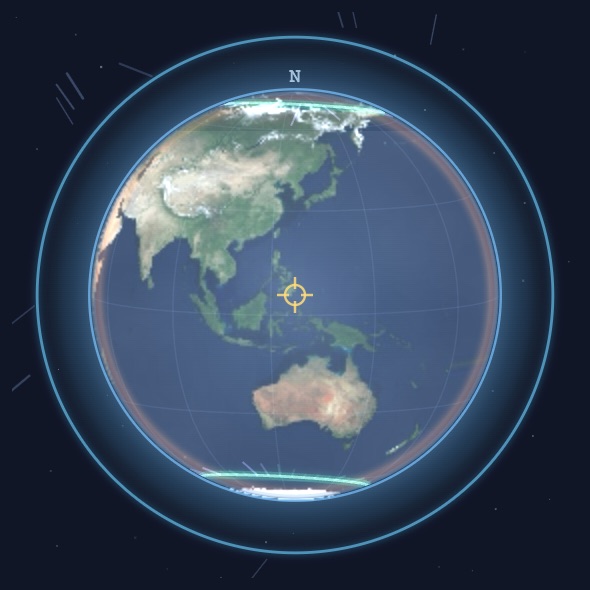
The Earth globe: the sunlit face at the displayed moment, with NOAA's aurora oval.
11The Sun (SDO) & coronagraph
Imagery from NASA's Solar Dynamics Observatory — live when the playhead is at "now" (refreshed every few minutes), and time-synced to the playhead otherwise: scrub or play into the past and the panel shows the closest archived full-disk frame (hourly, via Helioviewer), with a timestamp chip marking the moment. Frames are cached as you go, so replaying a storm gets smoother the more you watch. Before SDO's first light (May 2010) a placeholder appears instead. Three views:
- Corona 193Å — the million-degree corona; coronal holes and active regions.
- Chromo 304Å — the cooler chromosphere; prominences and filaments.
- Sunspots — the visible-light photosphere with sunspot groups.
Recent flares pulse at their location on the disk — timed to the playhead, so they match the frame you're looking at — and numbered active regions (sunspot groups) are marked when the image is current. The caption summarizes the current regions and flare tally.
Coronagraph
The card under the Sun panel shows the outer corona from NOAA's two coronagraphs: CCOR-2 on SOLAR-1 at L1 (the default) and CCOR-1 on GOES-19 in Earth orbit. This is the view every launch speed in the catalog comes from: a CME leaving the Sun appears as a bright loop pushing outward from behind the occulting disk. Like the Sun panel it is time-synced to the playhead, served from this site's own archive of frames (every frame since the instruments came online, plus older CCOR-1 frames back to 2025), with a timestamp chip and a note when the nearest frame is more than an hour away.
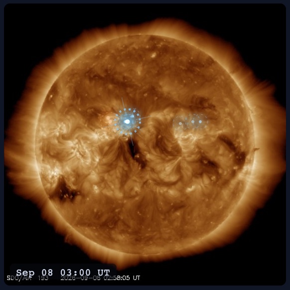
The Sun panel. SDO imagery at the displayed time, with today's numbered regions ringed.
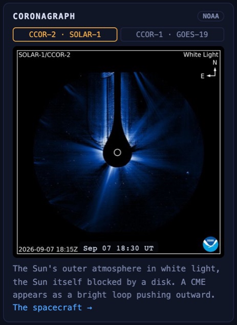
The coronagraph card. NOAA's CCOR imagery, scrubbable in time like the rest of the page.
12Wind, Kp & radiation cards (right panel)
Measured conditions at the L1 point (about 1.5 million km sunward of Earth — our ~30–60 min early-warning post) and at the ground:
- L1 nowcast: the highest-confidence short-range read. Because L1 sits ~1.5 million km sunward, whatever it measures reaches Earth ~30–60 min later (sooner when the wind is fast) — a measurement with a travel time, not a model. When quiet it shows the current wind, Bz, and that travel time; when a shock crosses L1 it flags an incoming sudden commencement with a live countdown to Earth; sustained strongly southward Bz warns that energy is about to couple into the magnetosphere. A nowcast, not a forecast — it reports only what's been measured.
- Solar wind — 7 days: wind speed and the interplanetary magnetic field Bz. Bz turning southward (negative) is the key storm trigger — it lets solar-wind energy pour into the magnetosphere.
- Geomagnetic activity (Kp): the planetary K-index in 3-hour steps. Kp ≥ 5 is a geomagnetic storm; the bars are colored by severity.
- Radiation storm (S-scale): solar-proton flux on NOAA's S1–S5 scale (set by the ≥10 MeV flux crossing 10 pfu) — the one space-weather hazard with a direct radiation dose to people (astronauts, polar-route aircrew), so the card names who's affected at each level. The top shows current conditions live, or that storm's peak in a replay. Select a CME and a line appears for the radiation storm that eruption produced: protons arrive within minutes–hours of launch (not days later with the CME), so a flare can dose Earth long before its CME arrives — and even a CME that misses Earth can dose it via magnetic connectivity.
13Time & playback
The tracker is a time machine: it can sit at the live moment, run forward to show forecasts, or rewind to replay what happened.
- The clock (top-left of the map) shows the displayed moment with a tag: LIVE (real time now), … AGO (the past), or +… FORECAST (the future).
- ▶ Play/pause animates time forward at the selected speed (also space).
- LIVE returns to live real time (also N or L).
- Speed buttons set how fast time runs:
1h/s,3h/s,6h/s,12h/s,1d/s(simulated hours-to-days per real second). - The timeline at the bottom is a scrubber spanning the loaded window. Triangles mark launches (coloured by speed class), dots mark predicted arrivals, and the orange line is the playhead; drag it to any moment.
- Isolate — the
⧉ Isolatebutton (right of the speed buttons) drops two handles on the timeline. Drag them to bracket a stretch of time, and the map replays only the CMEs that launched inside it — handy for studying one burst of activity without the clutter of everything still in flight. Toggle it off to bring them all back. - Timeline span — the
30d / 60d / 90dselector at the right of the transport sets how far back the scrubber reaches. Selecting an older CME from the catalog auto-widens the span so the playhead always stays on the bar.

The timeline. Triangles are CME launches, coloured by speed class; dots at the top are arrivals, each joined to its launch. Right of NOW is the future: forecast arrivals and the Regions facing Earth bars.
14The 3D view
The view control beside the Layers menu has four buttons: ⬒ Top-down, ◱ 3D, ◎ Magnetosphere and ⌓ Atmosphere. 3D swaps the flat map for the same solar system rendered as an actual three-dimensional scene. Everything else is unchanged — same physics, same catalog, same timeline, same clicking and hovering, and both the cinematic and classic looks apply. Only the projection differs.
Why it exists: latitude. The flat map draws every CME from its measured longitude and half-angle, and has no way to show the third number NASA also measures — the cone's latitude. So a CME erupting 55° above the Sun's equator gets painted sweeping straight across Earth, and then the card calls it a miss. In 3D the cone is simply where it really is: sailing over Earth's head. That contradiction is the best single reason to switch views.
Moving the camera
- Drag to orbit the Sun; scroll or pinch to move closer or further out.
⤾ viewresets the framing. - The camera never rolls, and it stops just short of the poles, so the plane of the solar system always reads level however far you swing around. Look straight down and you are back to very nearly the flat map — which is what makes moving between the two views readable rather than disorienting.
Vantage points
The dropdown to the right of the view switch decides where the camera sits. (It greys out in top-down mode, which has no camera to place.)
- Free orbit — the default: you float outside the system looking in.
- From Earth — the camera stands on Earth and looks back at the Sun. This is the geometry a coronagraph sees, and it is worth understanding: a CME aimed at you does not look like a cone off to one side, it looks like a ring opening around the Sun. That is a halo CME — which is why halos are at once the dangerous ones (they are coming at us) and the hardest to measure, since a ring hides how fast it is really travelling and looks much the same whether it is heading toward you or directly away. Here you can watch a wedge become a halo just by changing seats. In this vantage, dragging looks around and scrolling changes the focal length rather than the distance.
- When a front finally sweeps over your vantage point, the frame washes in that CME's colour — the storm arriving, seen from inside it, at the transit time the model predicts.
What else changes in 3D
- Earth pulses on impact on exactly the same frame as it does on the flat map — it is the same arrival test, not a second animation that might disagree with it.
- Old fronts recede. On a busy day forty-odd cones are in flight at once, and the oldest are also the largest, so left alone they bury the Sun and planets entirely. Once a front has passed the body you are watching — whichever one the
◎ Directed atdropdown is set to — it fades back quickly, because from that moment it is history. Set the target to Mars and Mars-bound fronts stay bright the whole way out to Mars. Inbound CMEs are never dimmed. - Spacecraft is worth turning on here. Parker Solar Probe and Solar Orbiter both fly tilted orbits, and this is the only view that can draw them where they actually are instead of reporting their height as a number in a label — Solar Orbiter swings up to roughly 0.18 AU clear of the plane, which is the entire point of the mission.
- Side view and Top view both work here, as picture-in-picture panels stacked at the bottom-left. The top view is the valuable one in 3D: perspective is what makes a three-dimensional scene worth having, and also what makes it worse at the question the flat map answers instantly — how far off the Sun–Earth line is this thing? Keeping the plan view in the corner gives you both answers at once.
Which view you get
Everything opens top-down — the live map and historical replays alike: plan view reads distances and angular separations truly, and that is what makes it a good instrument. Replays are a great place to try 3D, though — a replay carries around twenty CMEs rather than several hundred, so the view stays clear, and those are exactly the storms where a cone's true latitude is the story. The moment you touch the switch yourself your choice sticks for the rest of the visit and nothing moves it again. ?view=3d and ?view=2d set it from a link, and &eye=earth picks the vantage — so “look at this storm from Earth” is something you can send someone.
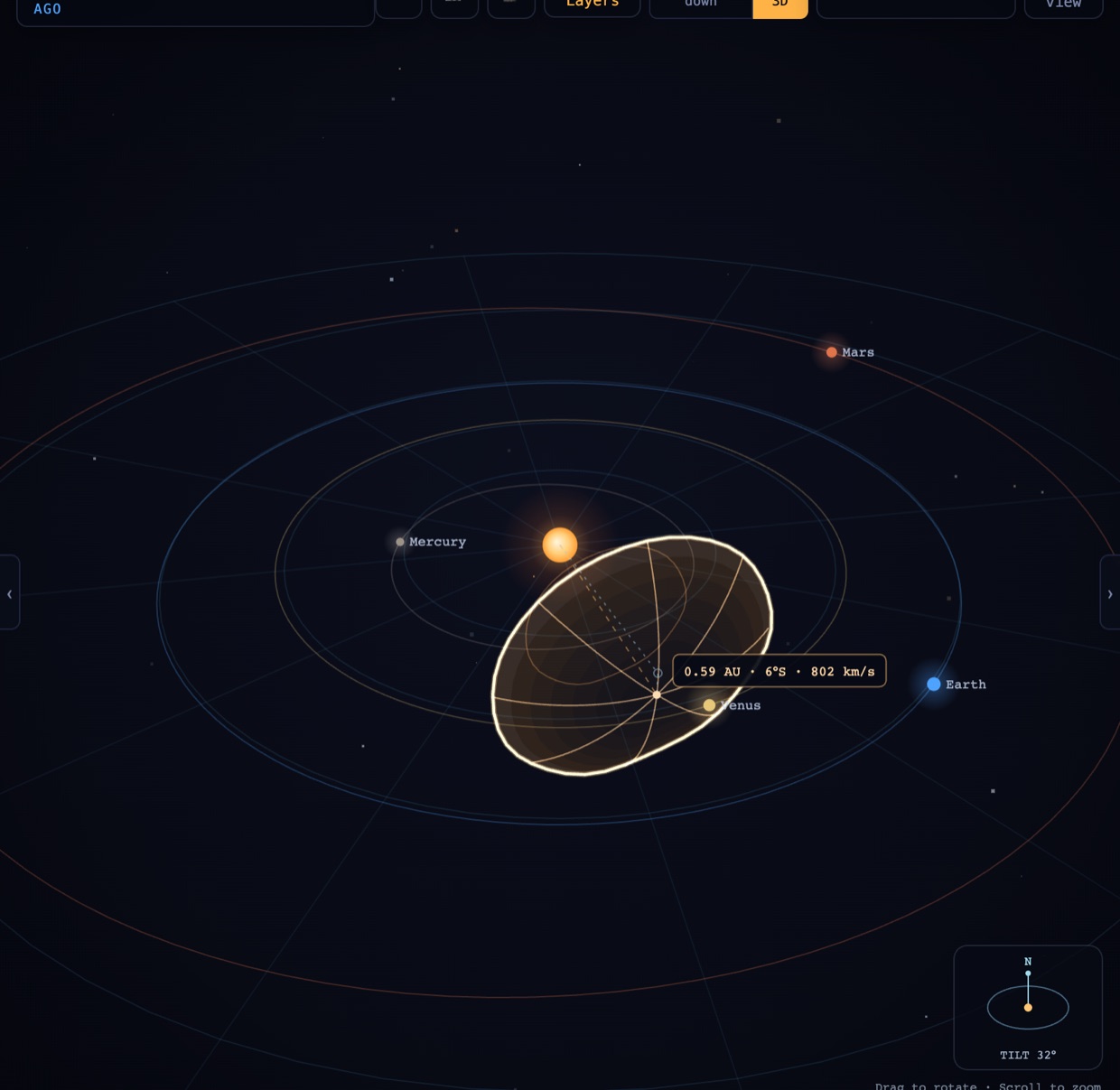
The 3D view with one CME soloed, mid-flight. The chip at the nose reads distance, latitude and speed; the dashed tether drops to the orbital plane so the latitude is visible; the compass shows the camera tilt.
15Historical event replay
Opening any storm from Famous CMEs loads it and turns the whole app into a scrubbable replay of it — great for seeing extremes and sanity-checking the model against known events. A banner shows you're in replay; ↩ Live returns to real time. Replays are also the best place to try the 3D view, where a storm's true latitude is visible. For the full story behind each one — history, impacts, and the science — see Famous CMEs.
| Event | Class | Why it matters |
|---|---|---|
| Gannon — May 2024 | G5 | Biggest storm in 20 years; aurora to the tropics. (DONKI-measured CMEs.) |
| September 2017 | G4 | X9.3 — largest flare of the solar cycle. (DONKI-measured CMEs.) |
| St. Patrick's — 2015 | G4 | A modest CME that punched far above its weight. (DONKI-measured CMEs.) |
| 2012 Near-Miss | — | A Carrington-class CME that crossed Earth's orbit and missed. (Measured at STEREO-A.) |
| Starlink Storm — Feb 2022 | G1 | A minor storm whose atmospheric drag destroyed 38 satellites. (DONKI-measured CMEs.) |
| Halloween — 2003 | G5 | The X17/X28 superstorms; grids and satellites hit. (CME reconstructed, measured wind + Kp.) |
| Quebec Blackout — 1989 | G5 | Grid collapse in 92 seconds; 6M people dark. (Measured Kp; wind & CME reconstructed — the storm fell in a data gap.) |
| Bastille Day — 2000 | G5 | Extreme Bz (−60 nT); aurora to Texas. (CME reconstructed, measured wind + Kp.) |
| Carrington — 1859 | G5 | The most intense storm on record — a reconstruction (no instruments existed). |
| Railroad Storm — 1921 | G5-class | The 20th century's deepest storm; telegraph fires on two continents. (Reconstruction.) |
| Almost-War — May 1967 | Kp 9 | The flare that jammed missile-warning radars and nearly started a war. (Kp measured.) |
| Sea-Mine — Aug 1972 | Kp 9 | Fastest transit on record (~14.6 h); detonated sea mines off Vietnam. (Kp measured.) |
Provenance is labeled honestly: measured archive data vs. reconstruction (estimated). For the 2012 near-miss, a special card shows what STEREO-A measured — the storm Earth was spared — while the globe correctly stays calm.
Shareable links. Each replay has its own web address (for example cmetracker.ai/live?event=gannon-2024), so you can bookmark a storm or send someone a link that opens straight into that replay. Your browser's back and forward buttons step between events too.

The replay banner. Everything on the page below it is the archived data for that storm; Live returns to now.
17On a phone
The tracker restacks on a phone: header readouts (wind, Kp and Dst), the map with Layers and the view switch, the transport and timeline, then the catalog and the dashboard cards in a single column.
- The catalog's filters fold behind a ⚙ Filters button, and the list is capped behind Show all CMEs.
- Tap a wedge or a row and the Selected CME card opens as a sheet over the map; swipe it down or tap the map to close it.
- The view switch and the camera select merge into one selector: Top-down, 3D (free orbit or from Earth), Magnetosphere (free orbit, from above or from the side) and Atmosphere.
- In the Atmosphere view, tap a satellite's dot for its numbers and tap elsewhere to clear them. The density bars sit under the Earth.
- Some desktop tools are left out for space: Isolate, the 30/60/90-day span, the UT toggle, PNG export, clip recording, the 3 h and 12 h speeds and the Recent flares list. Rotate to landscape or use a tablet for the full set.
- Hover tooltips don't exist on touch; the help you'd get from them is on this page.
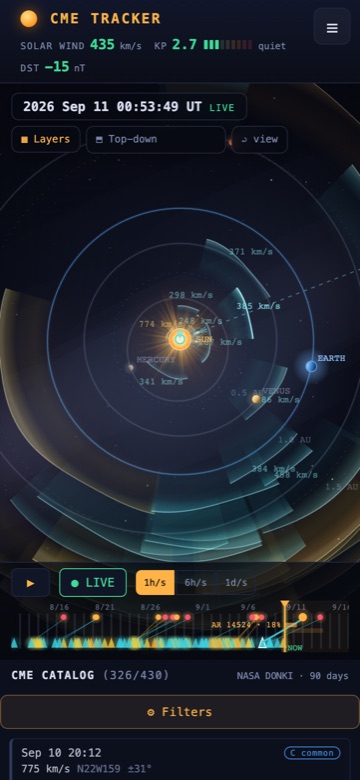
The phone layout: the map first, the timeline under it, and the panels stacked below.
18How accurate is it?
This isn't marketing — it's a real back-test. Every arrival the model would predict is compared against NASA's catalog of observed shock arrivals (hundreds of real CME→shock pairs); the full scoreboard and error histogram live on the science page.
- Typical (median) error ≈ 12 h; mean ≈ 15 h, with a 95% confidence interval shown on the card.
- Essentially unbiased — it doesn't systematically run early or late.
- Like-for-like on the same event set, NASA's full MHD model (WSA-Enlil) does somewhat better on the mean — ~11 h vs. our ~15 h — with the medians closer together (ours ≈12 h). Expected, since Enlil resolves the structured solar wind a two-parameter drag model only approximates; staying within a few hours of it is a strong showing for the simpler model.
- The histogram shows the spread; big misses are usually slow or poorly-observed CMEs.
The arrival window on the card comes from an ensemble. For every Earth-ward CME, a cron runs the fluid model 200 times with the cone's speed, direction, width and launch time and the background wind each perturbed by their known errors, then dresses each run with the model's own error, calibrated so the 10th-to-90th-percentile window really contains 80% of the catalogued arrivals (it does: 79% on the 214 rows where the cone crosses Earth, at a typical width of about 38 hours, or ±19). That's wider than the "±12 h" typical error above because it is an honest 80% window, not a median. Only wind measured before each CME launched goes in, so nothing about the storm leaks into its own forecast. The share of runs that cross Earth in the ecliptic is shown too, but it can't be calibrated on a catalogue that only contains hits, so read it as "how close to the cone's edge Earth sits", not as a probability of impact.
Live scoreboard. Every six hours a cron scans our own L1 archive for arrivals and scores each against the window that predicted it. Two kinds count: shock fronts (a 30 km/s jump with density and field both rising; that catches about 57% of the fronts NASA lists, the clear ones, with 81% precision) and gradual arrivals (a climb of 80 km/s or more inside six hours that falls back within a day and a half, the signature of a CME body reaching L1 without a shock, which is how the Sept 6 2026 CME arrived; a rise that stays up for days is a coronal-hole stream and is not counted). Loading the last 90 days…
Storm magnitude has its own back-test. The Kp estimate is calibrated against 221 observed CME→storm events (2014–2024; the subset of the 282 timed arrivals that came with a clean measured storm response): the most-likely level is right or within one G-level about 84% of the time, and no launch-time model can do much better — at a fixed prediction, real outcomes still span roughly ±2 Kp, because the deciding variable (the CME's field orientation) is unknowable until L1. That's why everything here shows a range rather than a single confident number; a single-level call only becomes honest ~30–60 minutes out, when the field is actually measured.
The model is the analytic Drag-Based Model (Vršnak et al. 2013): each CME starts at 21.5 solar radii with its measured speed and coasts toward the ambient solar-wind speed under aerodynamic drag. Most of the remaining error comes not from the propagation but from the input — the coronagraph-derived speed and direction, especially for halo CMEs.
Want the full derivation? The science & math behind CME Tracker walks through every equation — the drag model, the cone geometry, the ephemerides, the storm heuristic, and the validation methodology — with the limitations stated plainly.
19Controls reference
Keyboard
| space | Play / pause time |
| N / L | Return to live / exit replay |
| ← / → | Step time back / forward (hold shift for a full day) |
| ↑ / ↓ | Select previous / next CME |
| 1 / 2 / 3 | Layer presets: Monitoring / Clean / Sensory overload |
| Esc | Close a popup, the Layers menu or a dialog; with nothing open, deselect the CME |
| Enter | Open the popup of a focused header readout |
Mouse
| Scroll | Zoom the map — in 3D, move the camera nearer or further |
| Drag | Pan the map — in 3D, orbit the camera (or look around, from a body vantage) |
| Click cone / row | Select a CME |
| Hover | Quick tooltip |
Other tools
UTtoggles between UTC and your local time zone everywhere (display only — no change to the physics).- Collapsible panels — the chevron tabs (
‹/›) at the left and right edges of the map hide the catalog or the dashboards, expanding the map to fill the space. Your choice is remembered between visits. - The
▦ Layersmenu groups the map overlays — Regions facing Earth, Fluid model, Streams, Parker spiral, Connectivity, Spacecraft, Radiation belts, Solar flares, Radio bursts, Side view, Top view, Sparkles, Labels and Cinematic view — each described in §3 Layers. - The view control (
⬒ Top-down,◱ 3D,◎ Magnetosphere,⌓ Atmosphere) changes what the stage shows, and the camera select beside it places the camera: Free orbit or From Earth in 3D, Free orbit, From above or From the side on the magnetosphere stage (see §14 and §9). - Collapsible cards — click any card title in the right panel to fold it to one line. A folded card shows a live summary in its header. A card whose state turns urgent (a shock or strongly southward field at L1, a radiation storm, the magnetopause inside GEO, storm-level drag, Kp 5 or more) opens itself once; close it and it stays closed until that episode ends. Your folded set is remembered.
- The
◎ Directed atdropdown re-aims the geometry & arrivals at Mercury, Venus, Mars, or Solar Orbiter (see §5);⧉ Isolatereplays just a chosen stretch of the timeline (see §13). - Live feeds refresh automatically every few minutes; the Data indicator shows freshness.
20Glossary
- CME
- Coronal mass ejection — a large eruption of magnetized plasma from the Sun.
- Solar flare
- A sudden burst of radiation from the Sun, classed A/B/C/M/X by X-ray brightness. Often (not always) accompanies a CME.
- Solar wind
- The continuous stream of charged particles flowing out from the Sun (~300–800 km/s).
- IMF / Bz
- The interplanetary magnetic field carried by the solar wind. Its north-south component, Bz, is decisive: strong southward (negative) Bz drives geomagnetic storms.
- Kp index
- A 0–9 scale of global geomagnetic disturbance, in 3-hour steps. Kp ≥ 5 = storm.
- NOAA G-scale
- Storm severity from the peak Kp:
| Scale | Kp | Effect |
|---|---|---|
| G1 Minor | 5 | Minor grid swings; aurora at high latitudes. |
| G2 Moderate | 6 | Aurora to mid-latitudes; HF radio fades. |
| G3 Strong | 7 | Surface charging; satellite drag; wider aurora. |
| G4 Severe | 8 | Grid voltage problems; aurora to low latitudes. |
| G5 Extreme | 9 | Grids at risk; aurora near the tropics. |
- Half-angle
- Half the angular width of the CME cone, as fitted from coronagraph imagery. The map draws each cone spanning ± the half-angle around its axis.
- Halo CME
- A CME aimed nearly along the Sun–Earth line, so it appears as a halo around the Sun in coronagraphs — usually Earth-directed.
- R☉ / AU
- Solar radius (~696,000 km) and astronomical unit (~150 million km, the Sun–Earth distance). CMEs are tracked from 21.5 R☉ outward.
- DBM
- Drag-Based Model — the analytic propagation model used here (see §17).
- L1
- The Sun–Earth Lagrange point ~1.5M km sunward, where SOLAR-1 (with ACE and IMAP as backups; DSCOVR until spring 2026) measures the wind ~30–60 min before it reaches Earth.
- Magnetosphere
- The protective magnetic bubble around Earth; the magnetopause is its sunward boundary, which compresses under a storm.
- Sub-solar point
- The point on Earth where the Sun is directly overhead.
- Dst
- Disturbance storm-time index, in nanotesla: how much the ring current circling Earth has weakened the field at the equator. More negative is a deeper storm; −100 nT is intense, the Gannon storm reached −412, Carrington is estimated near −900. Hourly, from Kyoto.
- Coronagraph
- A telescope that blocks the Sun's disk with an occulting disk so the faint outer corona, and a CME leaving it, becomes visible. Every launch speed and direction in the catalog starts as a coronagraph measurement.
- Coronal hole / high-speed stream
- An open-field region of the corona that lets fast wind (600–800 km/s) escape. The stream sweeps past Earth as a corotating spiral and returns about 27 days later; see the Streams layer.
- Type II radio burst
- A slow-drifting radio sweep from a shock leaving the Sun, usually the first sign a CME has launched, typically half an hour before a coronagraph sees it.
- Sheath / flux rope
- The two parts of a CME at Earth: the compressed, turbulent wind piled up behind the shock (the sheath), then the smooth twisted magnetic cloud itself (the flux rope), whose Bz decides the storm.
- Aurora oval
- The ring around each magnetic pole where aurora occurs. Kp sets how far toward the equator it reaches; the Earth globe draws it at the displayed Kp.
21Frequently asked questions
What is a coronal mass ejection (CME)?
A coronal mass ejection is a large eruption of magnetized plasma — often a billion tons of it — blasted off the Sun's corona. When an Earth-directed CME arrives, typically 1 to 3 days after it launches, it can compress Earth's magnetic field and trigger a geomagnetic storm, auroras, and disruptions to satellites, radio, and power grids.
How accurate are CME arrival-time predictions?
CME Tracker's arrival estimates have a median error of 12.3 hours and a mean of 14.8 hours, validated by back-testing the model against 282 real shock arrivals in NASA's catalog (2014 to 2024). NASA's full magnetohydrodynamic model, WSA-Enlil, scores a mean of 11.2 hours on the same events, so it is better; both are hours, not minutes. Most of the remaining error comes from the coronagraph-measured launch speed and direction, not the propagation math. Treat arrivals as indicative, not operational forecasts.
How does the model predict when a CME will hit Earth?
It uses the analytic Drag-Based Model (Vršnak et al. 2013). Each CME starts at 21.5 solar radii with the speed NASA's coronagraphs measured, then decelerates (or accelerates) toward the ambient solar-wind speed under aerodynamic drag — so fast CMEs lose much of their speed before arrival. A 3,000 km/s CME can arrive at under half that speed.
How much warning is there before a solar storm hits Earth?
It depends on the source. A CME's arrival is forecast 1 to 3 days ahead (±~12 h). The highest-confidence warning, though, comes ~30–60 minutes out: spacecraft at the L1 point (~1.5 million km sunward) measure the solar wind and magnetic field before it reaches Earth, so when a shock crosses L1 the tracker's L1 nowcast counts down its arrival with near-certainty. Solar-flare radiation, by contrast, arrives in about 8 minutes.
Will a CME hit Earth, or miss it?
Each CME is drawn as a cone in its measured launch direction; Earth is hit only when it falls inside that cone. The catalog labels every CME Earth-directed, glancing, misses Earth, or awaiting telemetry (direction not yet determined). The 2012 near-miss replay shows a Carrington-class CME that crossed Earth's orbit and missed because Earth was elsewhere.
What is the difference between a solar flare and a CME?
A solar flare is a sudden burst of radiation (graded A/B/C/M/X by X-ray brightness) that reaches Earth in about 8 minutes. A CME is a slower, physical cloud of plasma that takes days to arrive. They often erupt together, but either can occur without the other.
I'm a radio operator — what does this mean for my bands?
Two separate hits. A flare ionizes the D-layer within minutes and absorbs HF on the sunlit hemisphere (NOAA's R scale) — it passes within the hour. A CME arrival drives the geomagnetic storm: HF typically degrades for 24–48 hours (polar paths worst), while VHF operators may get auroral scatter on 6 m and 2 m. The radio conditions page rates 80–10 m day/night from the live SFI, sunspot number, A-index and Kp, shows blackout status, and warns about inbound CMEs days ahead — and every storm-capable CME's impact card and alert email carries a radio line.
What are the Kp index and the NOAA G-scale?
Kp is a 0–9 measure of global geomagnetic disturbance. The NOAA G-scale maps the peak Kp to storm severity: G1 (Kp 5, minor) through G5 (Kp 9, extreme). A higher Kp pushes auroras toward the equator — CME Tracker sizes its aurora ovals by Kp. The header's Kp meter shows where the current value sits on the 0–9 scale; click it for a week of history and NOAA's 3-day forecast.
Is CME Tracker real-time, and where does the data come from?
Yes. CMEs and flares come from NASA DONKI, live solar wind and Kp from NOAA SWPC, and solar imagery from NASA SDO; historical replays use CDAWeb OMNI/STEREO and GFZ Potsdam. It is free to use, with no account required.
For official space-weather forecasts, see NOAA SWPC.
22Data sources & credits
Who the spacecraft are and what each one measures, with pictures: the spacecraft page. The feeds themselves:
- CMEs & flares: NASA DONKI + shock catalog.
- Solar imagery: NASA SDO; archived time-of-event frames via Helioviewer.
- Solar wind, Kp, flares, radiation (live): NOAA SWPC — including the high-cadence L1 feed that powers the nowcast (SOLAR-1 since spring 2026, with ACE and IMAP as backups; DSCOVR before that), and the daily solar indices (10.7 cm flux, sunspot number, A-index) behind the header gauges and the radio conditions page.
- Historical wind / Kp: CDAWeb OMNI & STEREO; GFZ Potsdam.
Curious what this site knows about you? Very little, on purpose — see the privacy statement.
Put it on your own site: free embeddable widgets (plain iframes, no scripts) — the live map, the headline numbers, the aurora outlook, and HF band conditions — plus an open JSON API. Pick one and copy the snippet at Embed CME Tracker.
23Feedback
This is a one-person project and I'd genuinely like to hear from you — what's useful, what's confusing, a bug, or a feature you'd want. If you teach with it, please say so — I want to make it work better in the classroom.
Stay in the loop
Want to know when a storm is coming? Subscribers get a two-stage warning. First a heads-up days ahead when a significant Earth-directed CME is detected, stated as a range ("G1 likely, could reach G3"). Then, when the L1 monitor measures sustained storm conditions actually inbound, the arrival alert: about an hour before the storm reaches Earth, calling the band the measurement supports ("G1 to G2"). A couple of hours after that you get one follow-up saying whether the storm verified or fizzled, because a forecast you never score is just a guess. Plus the occasional feature note. No spam, unsubscribe in one click. (Privacy: we store your address and nothing else.)